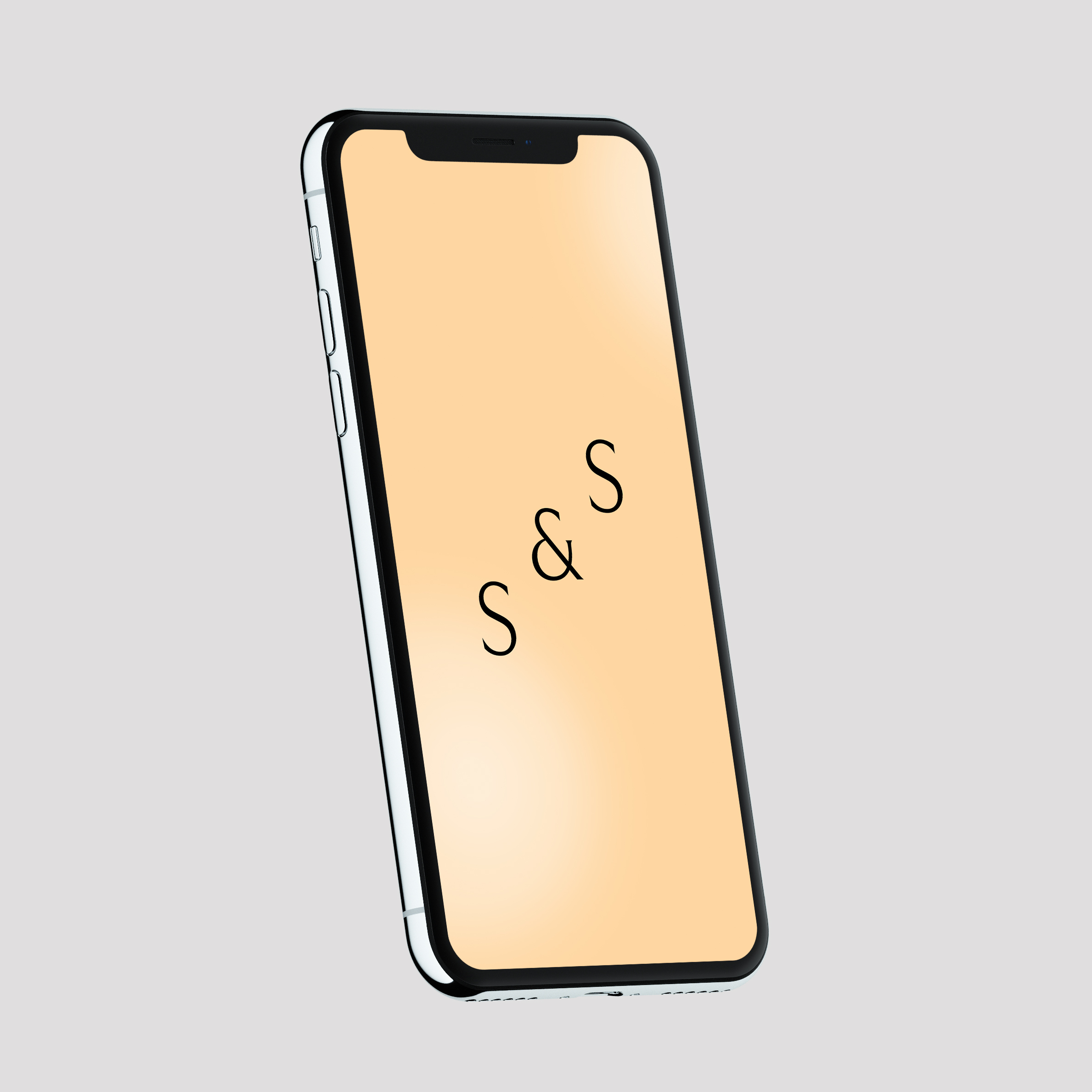
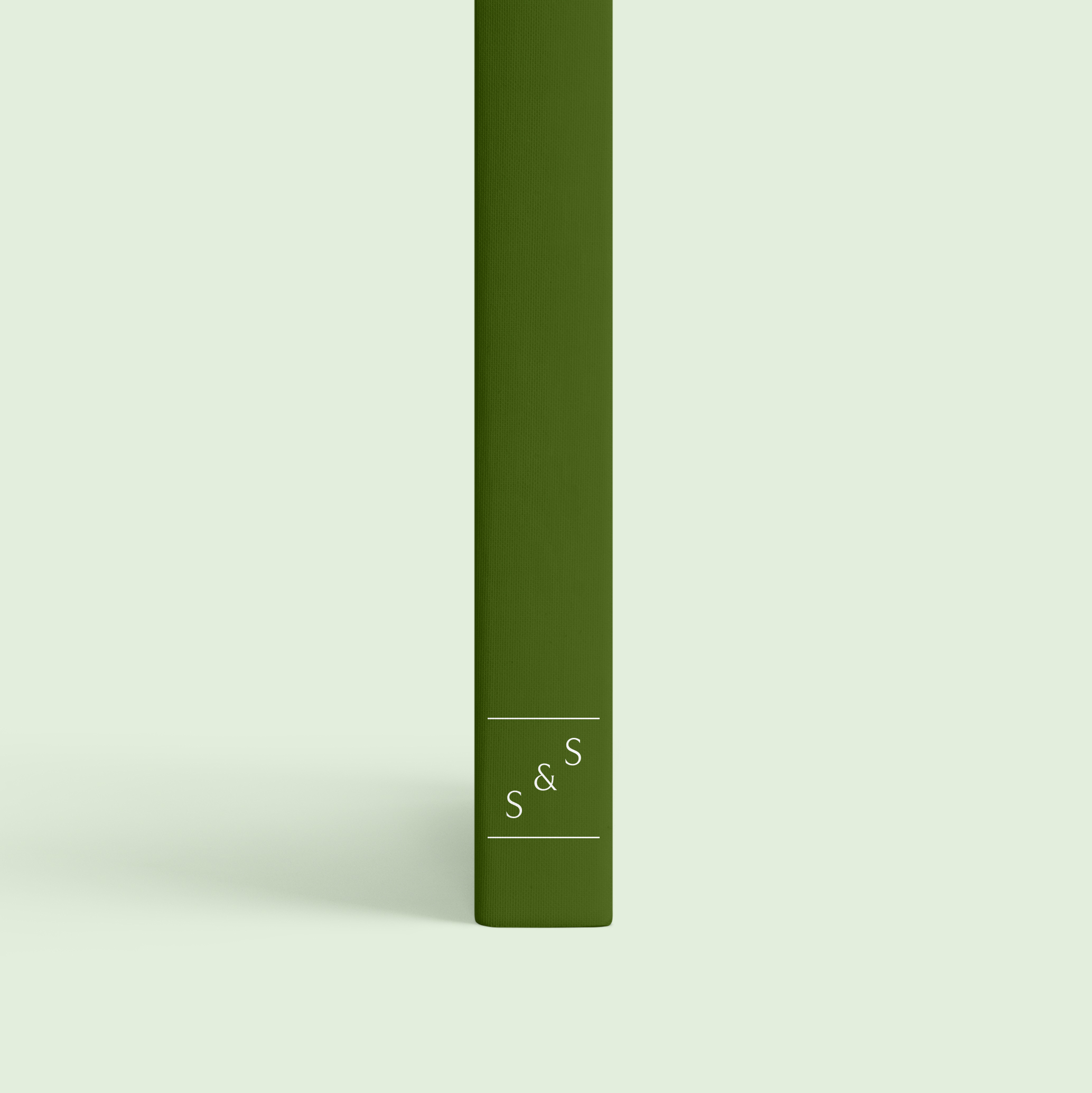
Schildts & Söderströms is the pre-eminent publisher of Swedish language literature in Finland. The rebranding of Schildts & Söderströms consists of a new logotype, a custom display typeface and three unique colour sets for the departments of Litteratur, Läromedel and Kustantamo S&S.
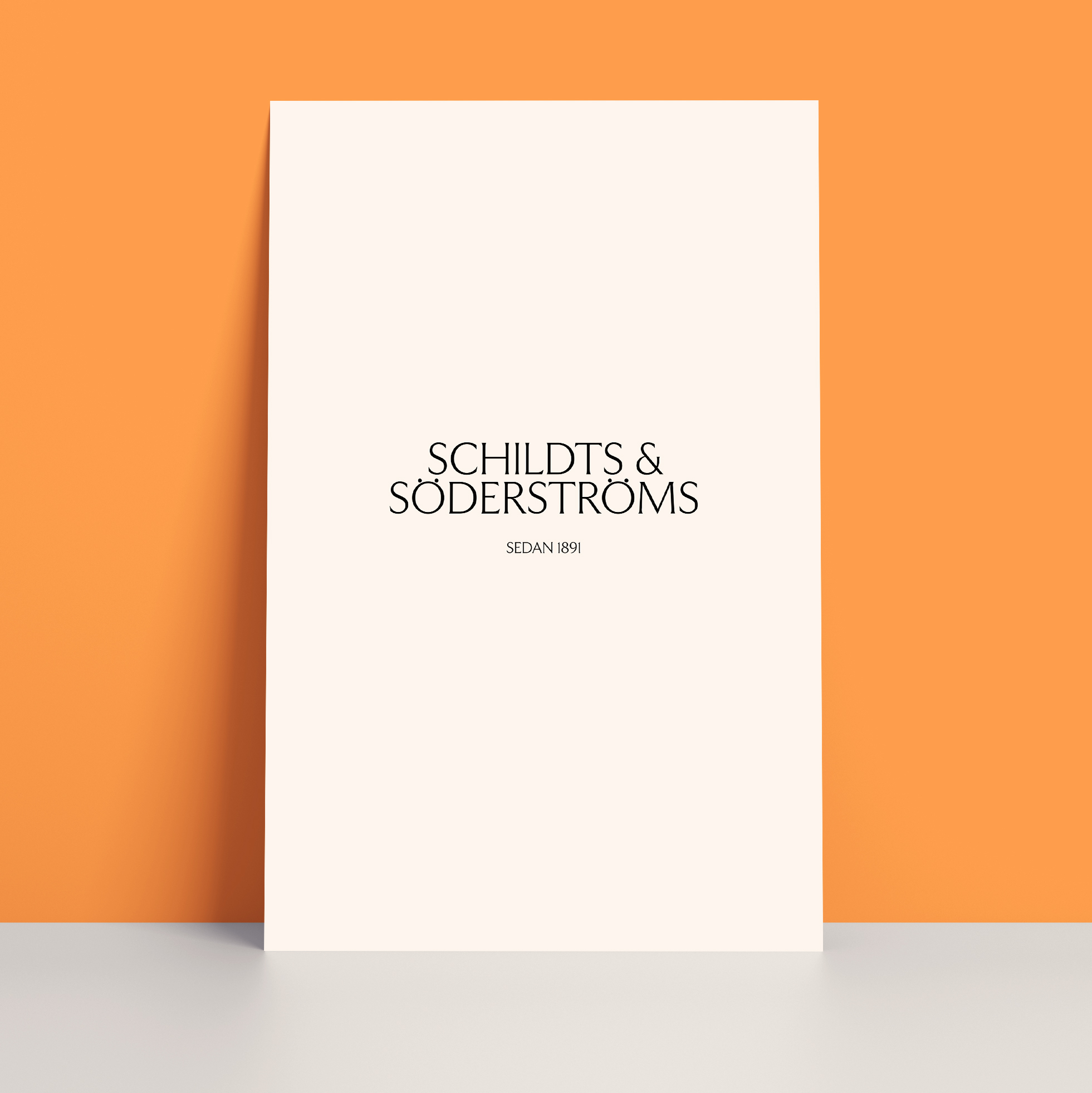
Type foundry Schick Toikka created a new display typeface that balances between the soft and hard, the modern and the traditional. The name Serifos is a play on the font's use of serifs, and the Greek island of Serifos in the Aegean Sea.
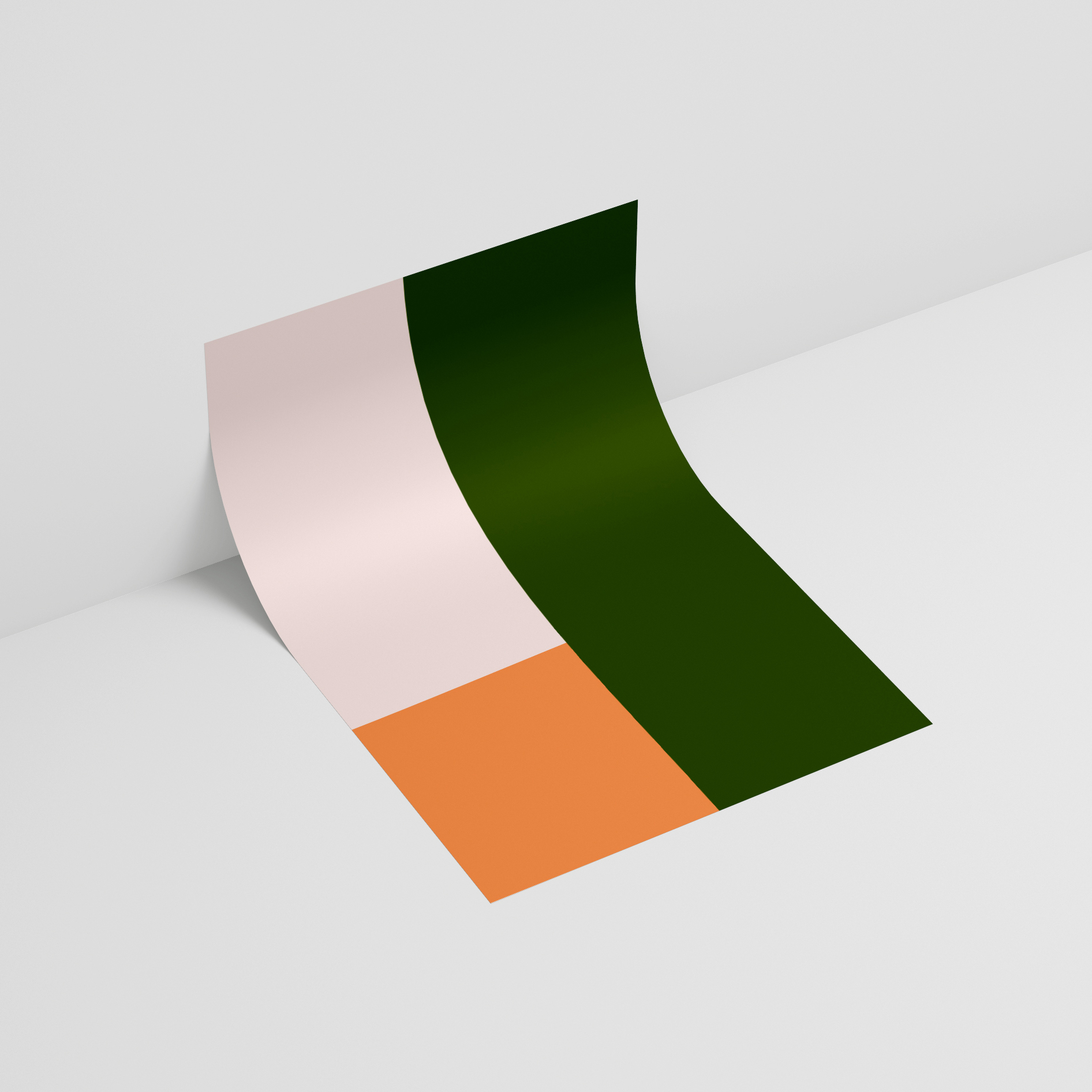

The colour palettes have a dual function; forming stark contrasts between the different departments, but at the same time to creating one unified visual aesthetic across the entire company.